
The Basics of Color Theory: Understanding How Colors Work in Art
Color theory is the foundation for many aspects of art, influencing not only how a piece is perceived but also how it is created. From the Renaissance to contemporary art, colors have played a key role in evoking emotions, guiding the viewer’s eye, and establishing the mood of a piece.
Whether working with traditional mediums like oil and watercolor or digital tools, every artist draws on principles of color theory. Understanding how colors interact is essential for any artist seeking to communicate visually. By grasping these basics, even a novice can start creating artwork that is both aesthetically pleasing and emotionally resonant.
We’ll delve deeper into the three critical areas of color theory: the color wheel and relationships, the psychological impact of color, and practical applications of color theory in art.
The Color Wheel and Basic Color Relationships
A firm grasp of color theory starts with an understanding of the color wheel, the visual representation of the relationships between colors. The color wheel, introduced by Sir Isaac Newton, arranges hues in a circular format, illustrating the connections between them. This tool is used by artists to understand how colors mix and interact, helping them to create balanced and harmonious works of art. By learning how colors relate to one another, artists can avoid chaotic compositions and produce visually engaging pieces that guide the viewer’s eye in a deliberate way.
Primary, Secondary, and Tertiary Colors
The color wheel begins with primary colors: red, blue, and yellow. These are the building blocks of all other colors and cannot be mixed from any other hues. When two primary colors are combined, they form secondary colors: green, orange, and purple. For example, mixing red and blue yields purple, while yellow and blue produce green. Taking this process further, tertiary colors are made by mixing a primary color with a neighboring secondary color, resulting in hues like red-orange or blue-green.
Color Harmony: Complementary, Analogous, and Triadic
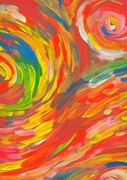
Understanding the relationships between colors is crucial for creating harmony in artwork. Complementary colors sit opposite each other on the color wheel (e.g., red and green or blue and orange). When placed together, these combinations create high contrast and dynamic compositions. In contrast, analogous colors are next to each other on the wheel, such as yellow, yellow-green, and green. These colors blend more subtly, producing soothing and cohesive images. Another balanced approach is the triadic scheme, which involves selecting three evenly spaced colors on the wheel, such as red, blue, and yellow, providing a more varied yet still harmonious palette.
Many famous paintings rely on these color relationships to create striking compositions. For instance, Vincent van Gogh’s “Starry Night” makes excellent use of complementary colors, with the swirling blue sky contrasting against vibrant orange stars. By carefully selecting color schemes, artists can craft visual experiences that resonate on a deeper level with viewers.
The Psychology of Color in Art
Colors have an incredible ability to evoke emotions and convey meaning in art. Beyond their visual impact, they are deeply tied to psychological and cultural interpretations. Artists often choose colors deliberately to influence how viewers emotionally engage with their work. Whether it’s evoking warmth, sadness, or energy, understanding the psychology of color allows artists to add layers of meaning to their art style that go beyond composition and form.
Warm, Cool, and Neutral Colors
Colors are often divided into three broad categories: warm, cool, and neutral. Warm colors—like red, yellow, and orange—are typically associated with energy, passion, and warmth. They can create a sense of urgency or movement in a piece. On the other hand, cool colors—like blue, green, and purple—are calming, associated with serenity and contemplation. Cool colors often appear to recede into the background, making them useful for creating depth in a composition.
Neutral colors, such as black, white, gray, and brown, serve a more balancing role. They can create contrast or serve as a backdrop, allowing other colors to pop without overwhelming the viewer. When used effectively, these neutrals can help guide the eye toward more vibrant elements in a piece.
Cultural Significance and Emotional Impact
Color meaning can also vary widely across different cultures and contexts. For example, while white often symbolizes purity or innocence in Western cultures, it represents mourning and death in many Eastern traditions. Similarly, red can symbolize love and passion in some contexts but can signify danger or anger in others. Artists like Pablo Picasso have used color meaning to great effect; his “Blue Period” paintings, filled with shades of blue, evoke feelings of melancholy and isolation, reflecting a time of personal grief and hardship for the artist.
Color psychology is a powerful tool in the artist’s toolbox, influencing how viewers feel and respond to a work. Whether used to evoke sadness, joy, or tension, the choice of colors plays a critical role in shaping the emotional narrative of the artwork.
Color in Practice: Mixing and Application
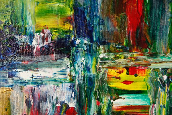
While understanding color theory on a conceptual level is important, practical application is where it truly becomes transformative for an artist. Knowing how to mix, apply, and manipulate colors on canvas allows an artist to breathe life into their creations. Whether working with traditional paints or digital media, the process of mixing colors, understanding saturation, and creating depth through color choices is fundamental to successful art.
Color Mixing: Additive and Subtractive
Artists working in traditional media like painting use the subtractive color model, where colors are mixed by subtracting wavelengths of light. For example, combining yellow and blue pigments subtracts wavelengths to produce green. In contrast, digital artists often work with the additive color model, where colors are created by adding light. Mixing red, green, and blue light in different combinations produces the entire spectrum of colors seen on screens.
In both models, saturation, tints, and shades are critical tools for manipulating colors. Saturation refers to the intensity of a color—how pure or muted it is. Tints are created by adding white to a color, making it lighter, while shades are created by adding black, making the color darker. Adjusting these elements can greatly affect the mood and tone of a piece.
Creating Depth with Color
One essential skill for artists is understanding how to use color to create depth and dimension. Warm colors like red and orange tend to appear closer to the viewer, while cool colors like blue and green recede into the background. This phenomenon allows artists to create a sense of three-dimensionality on a two-dimensional surface. By using this technique, artists can guide the viewer’s gaze through the composition, creating layers of interest and space.
Paint by Numbers and Learning Color Theory
For those new to color theory, easy-to-follow custom paint by number for beginners offers a hands-on way to practice these concepts. Paint by number kits are an excellent way for beginners to explore color application without the pressure of starting from scratch. These kits provide numbered sections corresponding to specific paint colors, teaching novice artists about color harmony, contrast, and the relationships between hues in a structured, approachable manner.
By working within a pre-designed framework, beginners can see firsthand how different colors interact and how a harmonious palette can elevate a simple image into something visually striking. The paint-by-numbers method allows for experimentation with color schemes, including complementary and analogous colors, making it an effective way to learn the basics of color theory in a practical, step-by-step process.
Conclusion
A solid understanding of color theory is essential for any artist aiming to create impactful and emotionally resonant work. From the basic principles of the color wheel to the emotional power of different hues, mastering these concepts can help elevate artistic creations. Learning how to mix colors, create depth, and apply them strategically transforms mere pigment into something profound. By practicing and applying these principles, even beginners can start to create artworks that communicate more powerfully through the language of color.